Making animation based on emissions dataset

Dataset introduction
The National Bureau of Economic Research (NBER) has a a very interesting dataset on the adoption of about 200 technologies in more than 150 countries since 1800. This is the Cross-country Historical Adoption of Technology (CHAT) dataset.
The following is a description of the variables:
| variable | class | description |
|---|---|---|
| variable | character | Variable name |
| label | character | Label for variable |
| iso3c | character | Country code |
| year | double | Year |
| group | character | Group (consumption/production) |
| category | character | Category |
| value | double | Value (related to label) |
Data cleaning
technology <- readr::read_csv('https://raw.githubusercontent.com/rfordatascience/tidytuesday/master/data/2022/2022-07-19/technology.csv')

#get all technologies
labels <- technology %>%
  distinct(variable, label)

# Get country names using 'countrycode' package
technology <- technology %>%
  filter(iso3c != "XCD") %>%
  mutate(iso3c = recode(iso3c, "ROM" = "ROU"),
         country = countrycode(iso3c, origin = "iso3c", destination = "country.name"),
         country = case_when(
           iso3c == "ANT" ~ "Netherlands Antilles",
           iso3c == "CSK" ~ "Czechoslovakia",
           iso3c == "XKX" ~ "Kosovo",
           TRUE           ~ country))

#make smaller dataframe on energy
energy <- technology %>%
  filter(category == "Energy")

# download CO2 per capita from World Bank using {wbstats} package
# https://data.worldbank.org/indicator/EN.ATM.CO2E.PC
co2_percap <- wb_data(country = "countries_only",
                      indicator = "EN.ATM.CO2E.PC",
                      start_date = 1970,
                      end_date = 2022,
                      return_wide=FALSE) %>%
  filter(!is.na(value)) %>%
  #drop unwanted variables
  select(-c(unit, obs_status, footnote, last_updated))

# get a list of countries and their characteristics
# we just want to get the region a country is in and its income level
countries <-  wb_cachelist$countries %>%
  select(iso3c,region,income_level)
Creating of a graph with the countries with the highest and lowest % contribution of renewables in energy production.
energy <- energy %>%

  #filteting out the NAs
  filter(!is.na(value))
Top 20 countries with highest % contribution of renewables in energy production
top_res <- energy %>%

  # dropping unnessecary columns
  select(-c(label, iso3c, group, category)) %>%

  #pivoting dataset wider
  pivot_wider(names_from = "variable",
              values_from = "value") %>%

  #filtering year 2019
  filter(year == 2019) %>%

  #grouping by country
  group_by(country) %>%

  #calculating the % of renewables in energy production
  summarise(total_res_perc = sum(elec_hydro, elec_solar, elec_wind, elec_renew_other)/ sum(elecprod)) %>%

  #arranging in descending order
  arrange(desc(total_res_perc)) %>%

  #choosing top 20 countries
  head(20)
Creating plot with Top 20 countries with highest % contribution of renewables in energy production
top_res_plot <- ggplot(top_res,
       aes(x = total_res_perc,
           y = fct_reorder(country, total_res_perc))) +
  geom_col() +
     labs(subtitle = "Highest",
       x = NULL,
       y = NULL) +
  theme_light() +
  theme(legend.position = "none") +
  scale_x_continuous(labels = scales::percent) +
  NULL
Top 20 countries with lowest % contribution of renewables in energy production
bot_res <- energy %>%

  # dropping unnessecary columns
  select(-c(label, iso3c, group, category)) %>%

  #pivoting dataset wider
  pivot_wider(names_from = "variable",
              values_from = "value") %>%

  #filtering year 2019
  filter(year == 2019) %>%

  #grouping by country
  group_by(country) %>%

  #calculating the % of renewables in energy production
  summarise(total_res_perc = sum(elec_hydro, elec_solar, elec_wind, elec_renew_other)/ sum(elecprod)) %>%

  #arranging in ascending order
  arrange(total_res_perc) %>%

  #choosing top 20 countries
  head(20)
Creating plot with Top 20 countries with lowest % contribution of renewables in energy production
bot_res_plot <- ggplot(bot_res,
       aes(x = total_res_perc,
           y = fct_reorder(country, total_res_perc))) +
  geom_col() +
     labs(subtitle = "Lowest",
       x = NULL,
       y = NULL) +
  theme_light() +
  theme(legend.position = "none") +
  scale_x_continuous(labels = scales::percent) +
  NULL
Joining two plots together with ‘patchwork’
res_plot <- top_res_plot / bot_res_plot +
  plot_annotation(title = "Highest and lowest % of renewables in energy production",
                  subtitle = "2019 data",
                  caption = "Source: NBER CHAT Database")

res_plot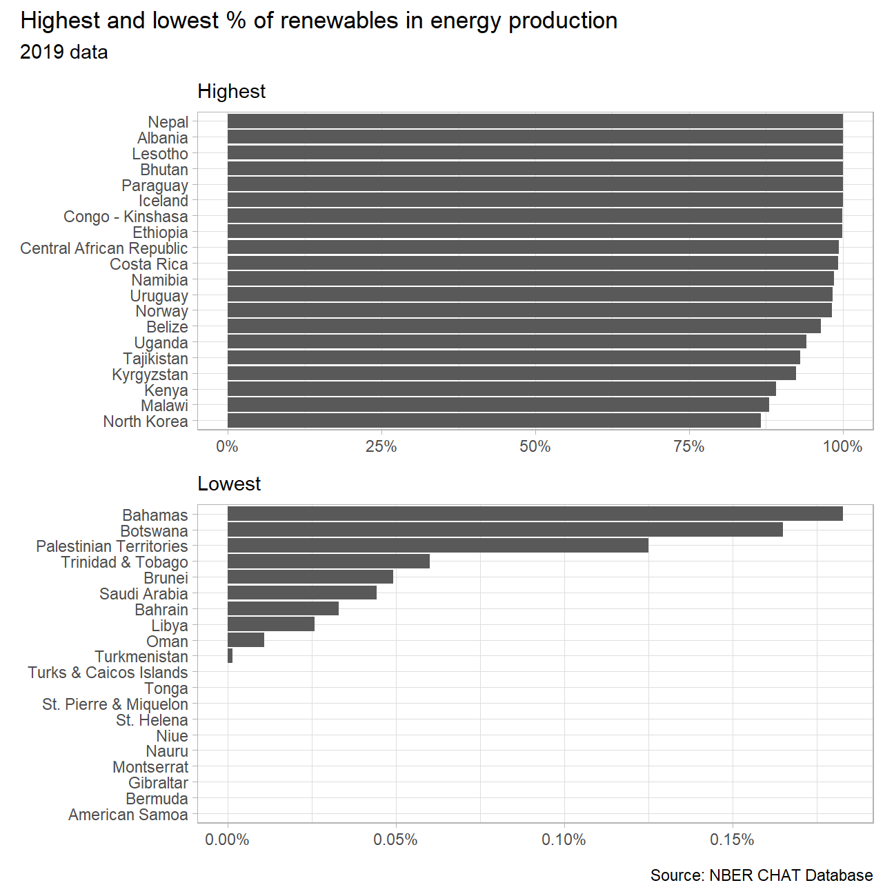
Creating an animation to explore the relationship between CO2 per capita emissions and the deployment of renewables.
#cleaning energy dataset
energy_1 <- energy %>%

  #removing not needed columns
  select(-c(label, group, category)) %>%

  #pivoting data wider
  pivot_wider(names_from = "variable",
              values_from = "value") %>%

  #Left-joining data
  left_join(y = countries, by = "iso3c") %>%

  #removing not needed columns
  select(-c(region))


#cleaning emissions dataset
co2_percap_new <- co2_percap %>%

  #renaming columns
  rename(CO2_emissions = "value",
         year = "date") %>%

  #selecting necessary columns
  select(iso3c, year, CO2_emissions)

#Left-joining energy_1 and co2_percap_new datasets
energy_new <- left_join(energy_1, co2_percap_new, by = c("iso3c" = "iso3c", "year" = "year"))
energy_plot <- energy_new %>%
#filtering year & NAs
filter(year >= 1991) %>%
filter(!is.na(income_level)) %>%
#grouping by country and year
group_by(country, year, income_level) %>%
#calculating the % of renewables in energy production
summarise(total_res_perc = sum(elec_hydro, elec_solar, elec_wind, elec_renew_other)/ sum(elecprod),
emissions = CO2_emissions)
#creating plot
p <- ggplot(energy_plot,
aes(x = total_res_perc,
y = emissions,
color = income_level)) +
geom_point() +
labs(title = 'Year: {as.integer(frame_time)}',
x = '% of renewables',
y = 'CO2 per cap',
caption = "Source: NBER CHAT Database") +
transition_time(year) +
ease_aes('linear') +
facet_wrap(~income_level, ncol = 2) +
theme_bw() +
theme(legend.position = "none") +
scale_x_continuous(labels = scales::percent) +
NULL
animate(p) 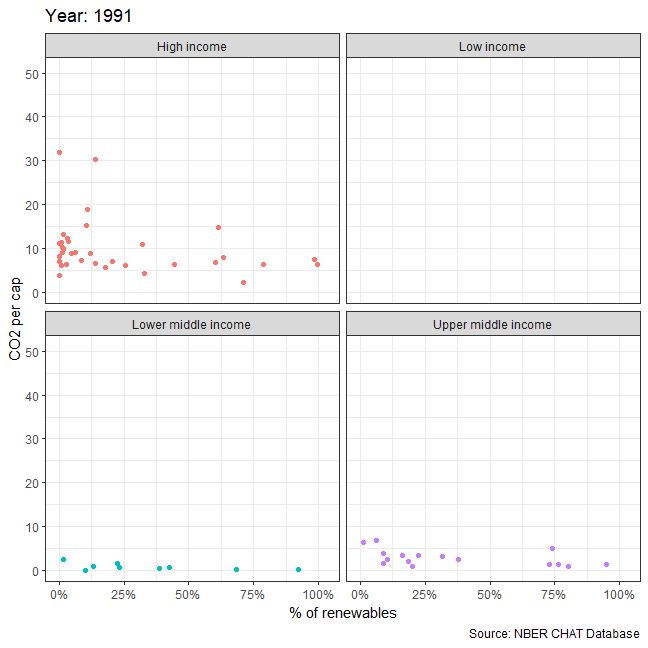
In every income group, it seems that % of renewables in energy production is negatively correlated with the amount of CO2 emitted per capita. Therefore, investing in such energy sources could be leveraged to achieve net zero strategies by countries all over the world.